

Friday, December 16, 2011
Dear Moderator
Dear Moderator,
Thanks for taking the time to look around our blog. Our individual blogs are linked to this page aswell as links to our teachers blogs. Both are found on the right hand side.
On this blog you will find our research, planning and production stages of our project. As you have probably noticed our music video and ancillary tasks have been posted at the top of the blog.
Use the labels, also on the right, to navigate our work.
Thanks, Group 5
Wednesday, December 14, 2011
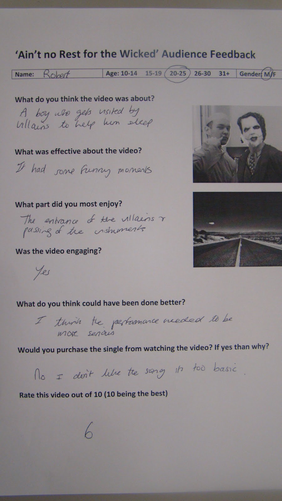
Audience Feedback Sheets
We took a sample of audience responses to our video, they were very positive and encouraging of our work however their were a few questions concerning the beginning of the piece as well as the end.


Although very positive feedback it appears that the beginning of the song was too slow in its build up and the end was 'unclear' and as shown in our audience response video people were unsure when it ended with a small round of applause just before the real end.


Although very positive feedback it appears that the beginning of the song was too slow in its build up and the end was 'unclear' and as shown in our audience response video people were unsure when it ended with a small round of applause just before the real end.
Our target audience responded perfectly however the higher end of the spectrum seemed to not enjoy the song itself, often claiming they would not buy the single/album as the genre is not too their liking for example, Rob a 25 year old who I asked to evaluate our video said 'I dont like the song' and 'Its not serious enough'. Despite our the older half of our target audience not enjoying the song I still feel we have targetted our audience successfully and we had a superb response during and after our screening.
Thursday, December 1, 2011


Friday, November 18, 2011
Website Development

We decided to get our music video done before we went on to do the album cover and website, which left us for a week for both.
We split the tasks and Lewis did the album cover and i did the website, however Lewis finished before me and so helped making the merchandise pictures and giving general critical advice on what i'd done and what to change which was very helpful.
We decided to have 9 pages (a homepage, about us section, news page, events page, photoshoots page, videos page, sign up page, competitions page and store) which we feel fully created band identity and also allowed the audience to get to know the band and utilise the site (entering competitions etc.) as much as possible.
Ways in which it promoted our music video:
-The videos page
- A link to the youtube page
- A news flash as to when the video premier is
Ways in which it promoted our album:
- clear links to buy the album and single
- clear links to the iTunes store
-kept up the road trip 'route 66' theme
Ways in which it promoted the band:
-lots of pictures
-kept up Americanised fun theme
-clear news into events and ticket purchasing
Ways in which the audience could get involved:
-The competitions page
-the merchandise store
-the comments box on the videos page
-the 'Messages to STA' box on the home page
-the signing up to the website to gain extra bonuses
-the clear links to ticket purchasing and album/single purchasing websites
Wednesday, November 16, 2011
The Album Cover
When designing the album cover I took into account the attributes of our band that made us different from other indie/alternative bands. We were care-free, cheeky and fun. Wanting to reflect this in the album artwork we decided to turn the band members into cartoons, this gave off the impression of immaturity and makes the whole thing seem non-naturalistic going hand in hand with the surrealism of our music video.
To construct the album we used Photoshop CS5, Its new colour effects such as 'vibrance' and 'luminosity' allowed us to make the album appear more eye-catching and colourful.

To construct the album we used Photoshop CS5, Its new colour effects such as 'vibrance' and 'luminosity' allowed us to make the album appear more eye-catching and colourful.

Tuesday, November 15, 2011
Our Digipack rough idea

This is our rough design for our album digipack, The front and back of the album our the top two images. We wanted to feature our band throughout the ablum to create a sense of identity. The front image features all the band members sitting on a sofa looking worn out and tired (Ain't no rest for the Wicked) as well as having a link to our songs it also has strong connotatins with a party lifestyle and ties in with the whole 'lack of sleep' theme with our debut single.
The band members are half dressed in their costumes showing the fans, or veiwers, the real faces behind the masks. This maintains a strong audience and band relationship as it fufils the urge to know who it is behind the costumes. The layout of the front cover is very casual which reflects how the band behave and that they dont take themselves too seriously and its more about just having fun.
Saturday, November 12, 2011
Photoshoots
We arranged a photoshoot to make sure we got images for our album cover and website and we feel it went very well!
Here are some of the shots we got:


Here are some of the shots we got:


Thursday, November 10, 2011
Editing
We made a decision in the editing process that Lewis was better at putting together the narritive pieces and I was better at doing the montagey collections so this is how we would split the editing.
As well as this we decided that our choruses would be filled with performance and our verses would be montages cut in with hints of performance or Lewis just singing in the bed.
We had quite a big difficulty with colour grading, however we felt for the style of our music video it didnt need to be perfect and also showed progression in our narrative, with it getting lighter as the morning draws nearer etc.
For an ending we also decided to play on the 'aint no rest' part of the song, giving a blackout as he falls asleep, and hear an alarm sound and then looping this back to the beginning, so its like he never gets any rest and always is for some reason up and awake which we thought added some comedy.
Comedy was a big theme in our edit, as the set never changed so we needed something else to keep up the audiences attention. Therefore in each verse we encorporated shots of our characters just being stupid and silly, as this also linked to the image of the band which was fun and freespirited.
Friday, November 4, 2011
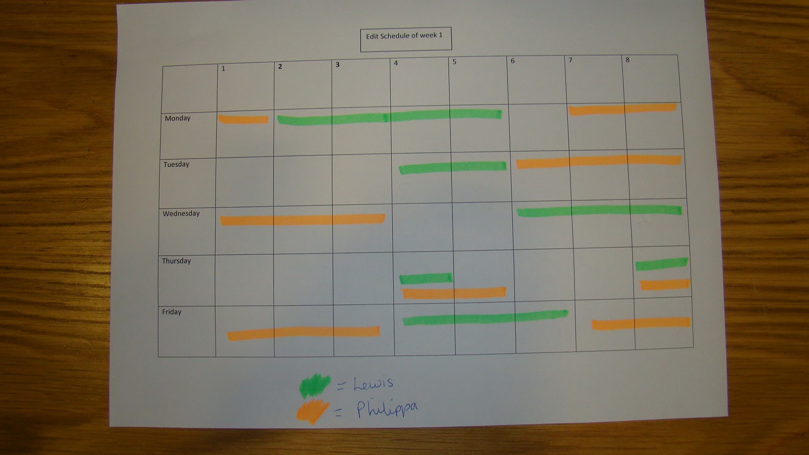
Edit Schedule
Thursday, November 3, 2011
First, Second and Final Shoot
For these shoots we had some advice on our lighting by our media technician who we asked to come along to the shoot.

As well as this we were alot more efficient and created shot lists which enabled us to stick to our time schedule better.
We had to change our Darth Vader actor unfortunately as the last actor broke his hand, so instead we replaced im with Leo who worked really hard and we feel we made a good choice of new actor as he played the funny role well.

To give us more time for shooting we decided to black out the windows so we could shoot from earlier in the day and this was really useful so we werent so pushed for time.
We also became more aware of looking in the background of shots to make sure there were no pieces of equipment showing.
Lastly we played around alot with focus pulls and different angles for our performance shots, as the actors were not very musically talented and so this almost hid it a bit.

Getting ready for our first shoot


We went over our storyboard and prepared shot lists of when to we need actors and when we are going to film which shots. This was to make sure we are 100% prepared and efficient during our shoot.
Test shoot
Test shoot key reflections:
-need to work on lighting
-set is fairly small so try not to get lighting kit in the background of shots etc.
-keep better control of actors (they are there to help us not mess around)
-get lots of different angles and framings to keep the one set looking interesting

-need to work on lighting
-set is fairly small so try not to get lighting kit in the background of shots etc.
-keep better control of actors (they are there to help us not mess around)
-get lots of different angles and framings to keep the one set looking interesting

Friday, October 21, 2011

Thursday, October 20, 2011
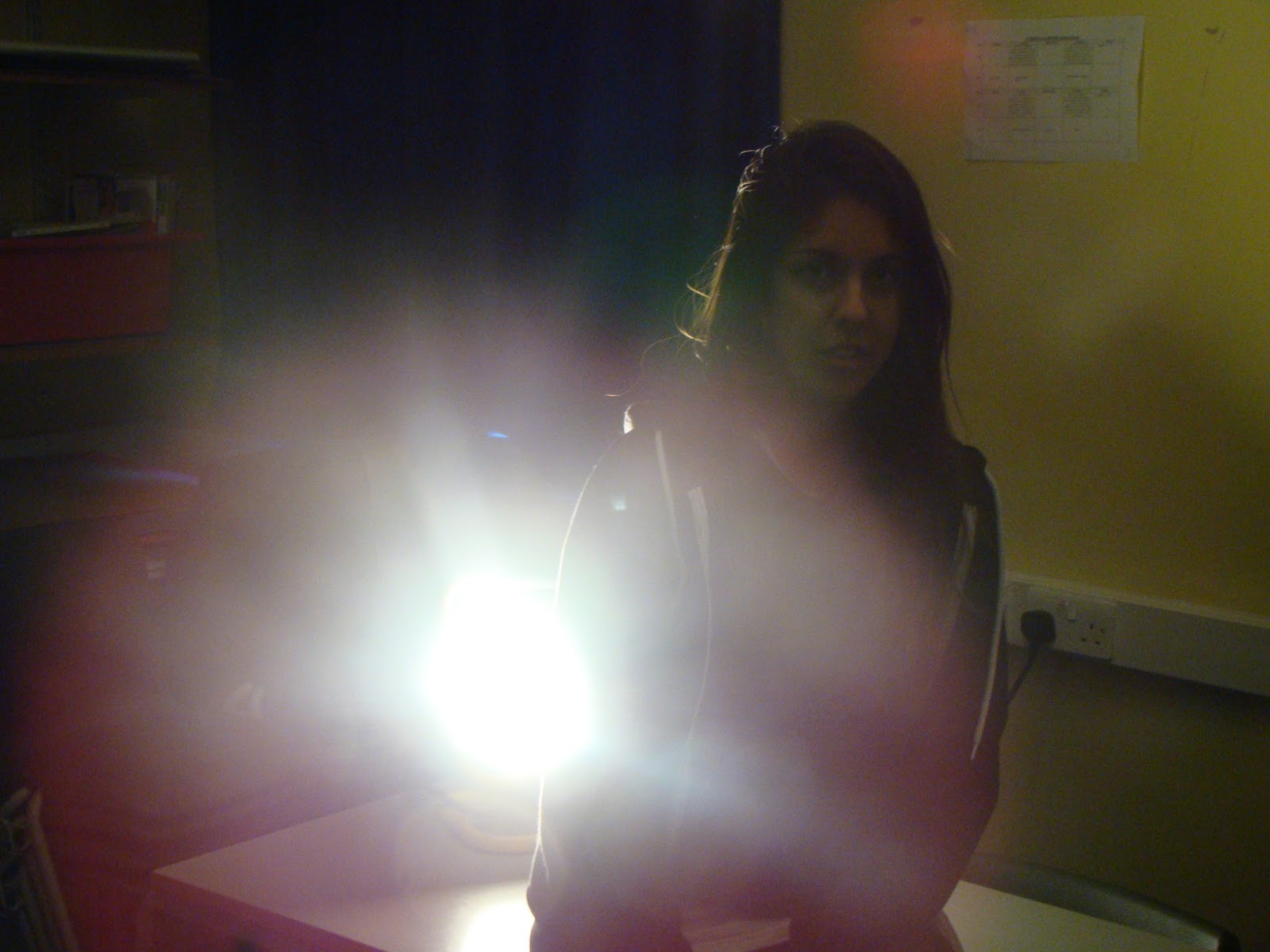
Lighting
We want to create some cool backlight effects in some shots (possibly to show eye strains of first turning on the lights after waking up etc.), as well as using the standard bedroom lights to light the set, for this we will use a big yellow light. We have tried it out in the media block to see what types of lighting and quirkiness we could create and have decided its perfect for our shoot (with the mindset that even if we dont end up using it, its useful to have just incase) .
Storyboard
We've written out a storyboard featuring a shot-by-shot idea of what we intend to shoot complete with shot angle and a slight description of what the shot will feature.


Wednesday, October 19, 2011


Tuesday, October 18, 2011
Album images ideas
We want the images of our band for our album/website to be fun and quirky, so we have been thinking of ideas as how to capture this and here is a summary of ideas in picture form.

 |
| Here the band are being ridiculous and are giving a matrix kind of feel with being totally serious yet doing stupid things, such as offering Tupperware and holding up children. |

 |
| underwater shots would be funny and cool but we have a dilemma as to how to get a camera into a public pool. |
Audience Research
After talking to members of our target audience 18-25 males and females, we deduced that the radio stations they would expect to find our song on are Radio 1 and XFM, to which we have found information about them to see potentially how much reach we could generate etc.
| Station | Coverage | Latest Audience Figures | Last Quarter | Last Year | |
| August 2011 | May 2011 | August 2010 | |||
| Audience | Reach | Audience | Audience | ||
| XFM London | Greater London | 671,000 | 6% | 604,000 | 553,000 |
| XFM Manchester | XFM Manchester | 151,000 | 5% | 135,000 | 179,000 |
| BBC Radio 1 | UK wide | 11,692,000 | 23% | 11,825,000 | 11,810,000 |
Aswel as this we asked them what they like about other indie bands and what they like about our band idea, here were some of the responses:
'I dont like indie bands that try too hard to be serious, its boring'
'Indie bands should just look like average normal people- approachable'
'I think your idea is good- no other really indie band has a really funny, carefree image, they are usually more punky bands that do this'
'I think them being funny would make them more appealing as they are relatable, just acting their age, like Sum 41 and band like that, except a different genre'

 |
| Pie chart showing percentage of people who liked different genres of music (as you can see indie is the largest) |
 |
| Within the indie percentage this pie chart shows the number of which are male and female giving us a better understanding of our target audience. |
Subscribe to:
Posts (Atom)