

Friday, December 16, 2011
Dear Moderator
Dear Moderator,
Thanks for taking the time to look around our blog. Our individual blogs are linked to this page aswell as links to our teachers blogs. Both are found on the right hand side.
On this blog you will find our research, planning and production stages of our project. As you have probably noticed our music video and ancillary tasks have been posted at the top of the blog.
Use the labels, also on the right, to navigate our work.
Thanks, Group 5
Wednesday, December 14, 2011
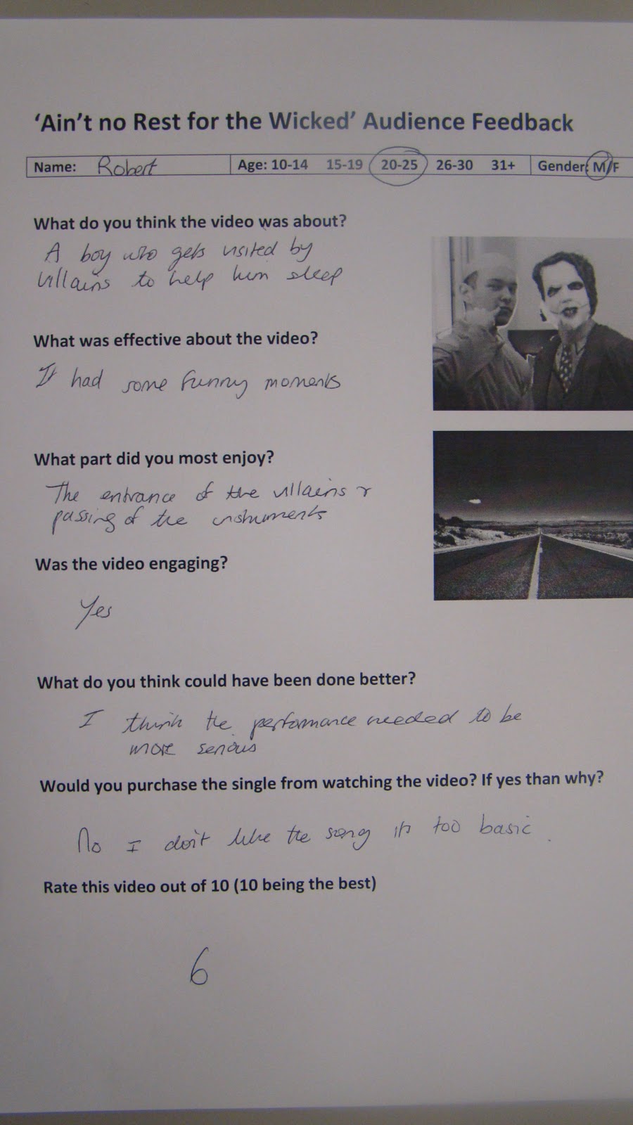
Audience Feedback Sheets
We took a sample of audience responses to our video, they were very positive and encouraging of our work however their were a few questions concerning the beginning of the piece as well as the end.


Although very positive feedback it appears that the beginning of the song was too slow in its build up and the end was 'unclear' and as shown in our audience response video people were unsure when it ended with a small round of applause just before the real end.


Although very positive feedback it appears that the beginning of the song was too slow in its build up and the end was 'unclear' and as shown in our audience response video people were unsure when it ended with a small round of applause just before the real end.
Our target audience responded perfectly however the higher end of the spectrum seemed to not enjoy the song itself, often claiming they would not buy the single/album as the genre is not too their liking for example, Rob a 25 year old who I asked to evaluate our video said 'I dont like the song' and 'Its not serious enough'. Despite our the older half of our target audience not enjoying the song I still feel we have targetted our audience successfully and we had a superb response during and after our screening.
Thursday, December 1, 2011


Friday, November 18, 2011
Website Development

We decided to get our music video done before we went on to do the album cover and website, which left us for a week for both.
We split the tasks and Lewis did the album cover and i did the website, however Lewis finished before me and so helped making the merchandise pictures and giving general critical advice on what i'd done and what to change which was very helpful.
We decided to have 9 pages (a homepage, about us section, news page, events page, photoshoots page, videos page, sign up page, competitions page and store) which we feel fully created band identity and also allowed the audience to get to know the band and utilise the site (entering competitions etc.) as much as possible.
Ways in which it promoted our music video:
-The videos page
- A link to the youtube page
- A news flash as to when the video premier is
Ways in which it promoted our album:
- clear links to buy the album and single
- clear links to the iTunes store
-kept up the road trip 'route 66' theme
Ways in which it promoted the band:
-lots of pictures
-kept up Americanised fun theme
-clear news into events and ticket purchasing
Ways in which the audience could get involved:
-The competitions page
-the merchandise store
-the comments box on the videos page
-the 'Messages to STA' box on the home page
-the signing up to the website to gain extra bonuses
-the clear links to ticket purchasing and album/single purchasing websites
Wednesday, November 16, 2011
The Album Cover
When designing the album cover I took into account the attributes of our band that made us different from other indie/alternative bands. We were care-free, cheeky and fun. Wanting to reflect this in the album artwork we decided to turn the band members into cartoons, this gave off the impression of immaturity and makes the whole thing seem non-naturalistic going hand in hand with the surrealism of our music video.
To construct the album we used Photoshop CS5, Its new colour effects such as 'vibrance' and 'luminosity' allowed us to make the album appear more eye-catching and colourful.

To construct the album we used Photoshop CS5, Its new colour effects such as 'vibrance' and 'luminosity' allowed us to make the album appear more eye-catching and colourful.

Tuesday, November 15, 2011
Our Digipack rough idea

This is our rough design for our album digipack, The front and back of the album our the top two images. We wanted to feature our band throughout the ablum to create a sense of identity. The front image features all the band members sitting on a sofa looking worn out and tired (Ain't no rest for the Wicked) as well as having a link to our songs it also has strong connotatins with a party lifestyle and ties in with the whole 'lack of sleep' theme with our debut single.
The band members are half dressed in their costumes showing the fans, or veiwers, the real faces behind the masks. This maintains a strong audience and band relationship as it fufils the urge to know who it is behind the costumes. The layout of the front cover is very casual which reflects how the band behave and that they dont take themselves too seriously and its more about just having fun.
Subscribe to:
Posts (Atom)